PSU School of Art + Art History + Design Promotional Kit
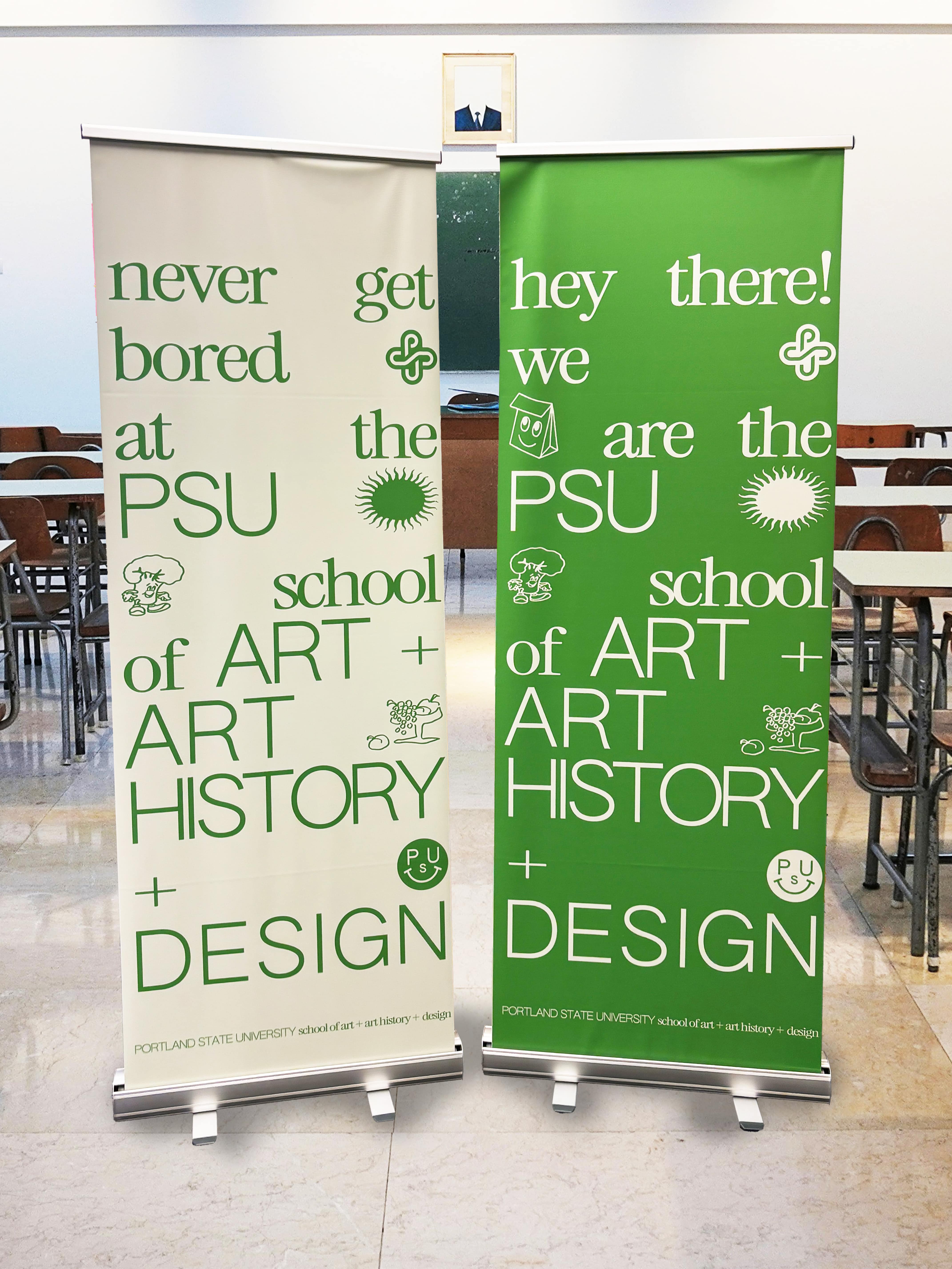
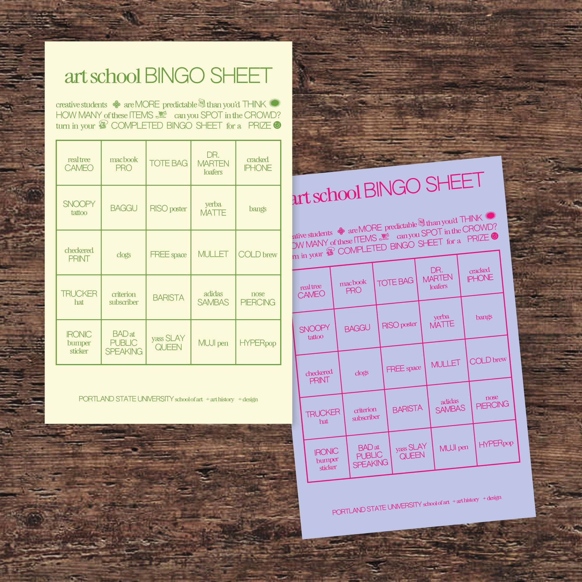
This was a project to create a brand for the School of Art + Art History + Design and apply that branding to items for student recruitment events with the goal of making materials that would attract prospective students. We were encouraged to think about what objects represent the school’s identity, choose the ones that represent the program's distinctive character, and apply that brand system across those touchpoints. My team and I worked with the school administrators from concept through production.
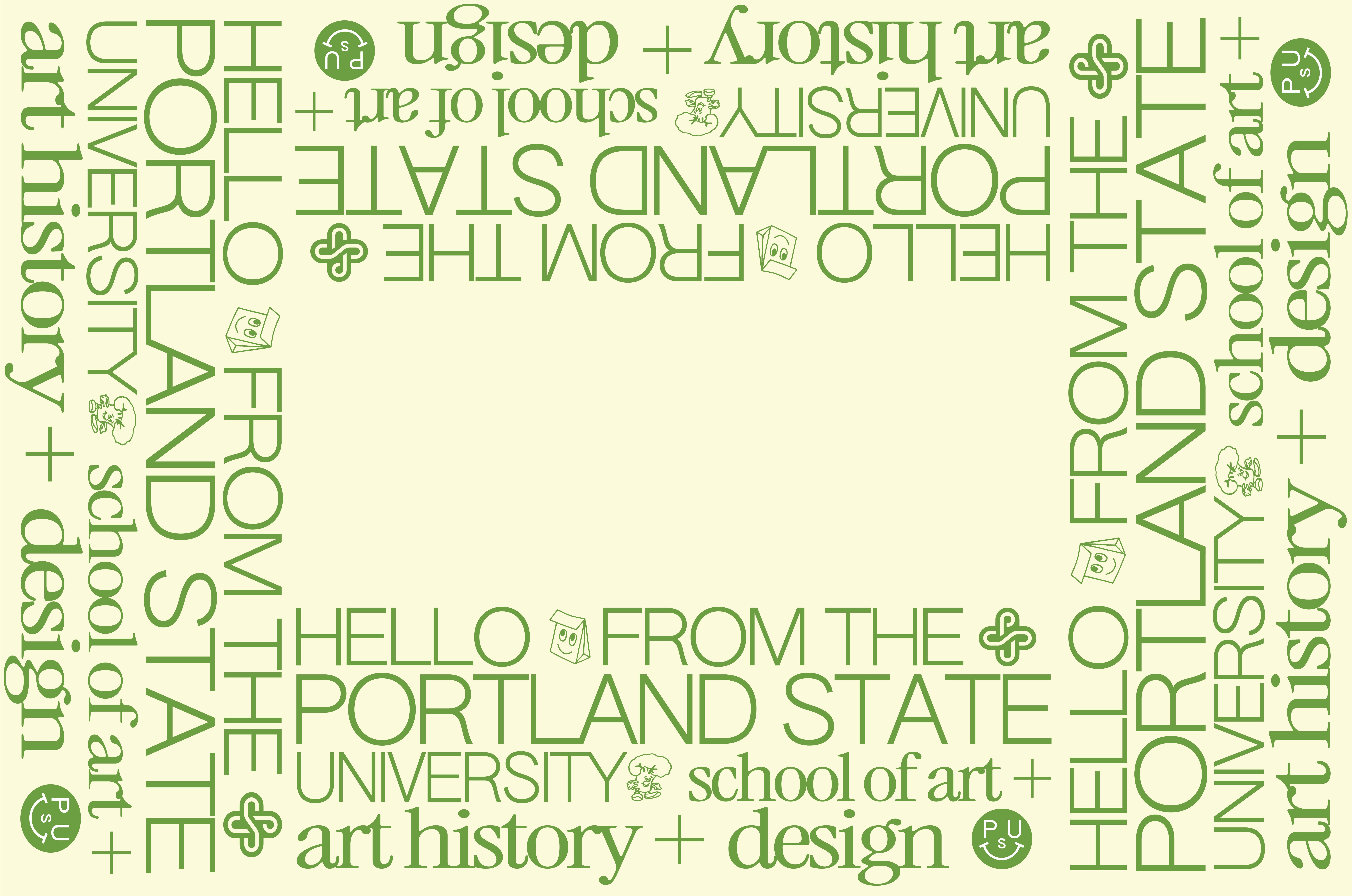
We started by each developing brand concepts, then we merged our visions into a single, unified idea as requested by the clients. Through collaboration, we created a colorful, typography-focused identity that balances the school's dual nature—both serious and playful. We paired a lowercase sans serif with a light, uppercase serif to reflect this versatility and to create a stark contrast. We also designed a glyph—a smiley face using the letters “PSU” as the facial features—to make the branding specific to the school.
The final brand system successfully captures the school’s double-edged personality, providing administrators with cohesive materials for recruitment events that authentically represent their creative community. Our branding received positive feedback from students and faculty members, boosting prospective student interest and increasing engagement through our branded recruitment materials.
The sticker sheet and pencil were entirely created by me. The rest of the deliverables were a team effort.
Roles
Art Direction
Page Layout
Branding
Copywriting
Team
Brenna Breman
Alex Shelley
Art Direction
Page Layout
Branding
Copywriting
Team
Brenna Breman
Alex Shelley


