Oregon Food Bank Ambassador Program
I was tasked with creating a multi-page document of the Oregon Food Bank’s Food Systems Ambassador Program, a program that helped local BIPOC residents become “ambassadors” in their community, teaching them skills to increase food security. This document would showcase both the program's successes and areas for improvement, persuading other nonprofits to implement similar community-serving initiatives. The document needed to be produced in both English and Spanish while maintaining their established brand identity. I was also asked to design graphs and charts to communicate data collected from the ambassador’s feedback.
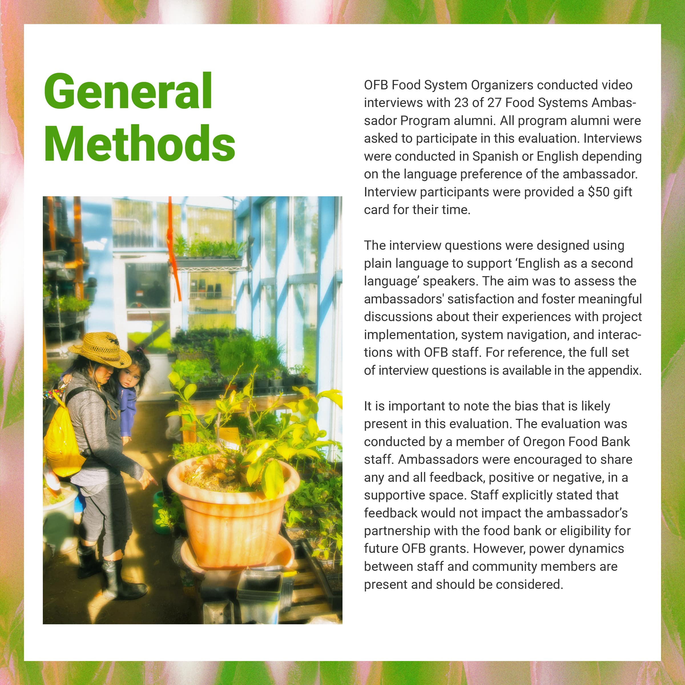
I worked directly with the Oregon Food Bank's (OFB) multimedia producer, handling everything from initial concept development through final production. My role was to translate their existing brand guidelines into a fresh visual direction while ensuring the document effectively communicated the program's value. As part of my inspiration, I reviewed their previous documents to identify elements that could be adapted for this project. The client encouraged me to push their brand concept as far as possible and gave me freedom to experiment within their guidelines. Throughout the design process, I made sure to explain my thinking behind specific design choices, regularly seeking feedback to ensure the document aligned with their vision.
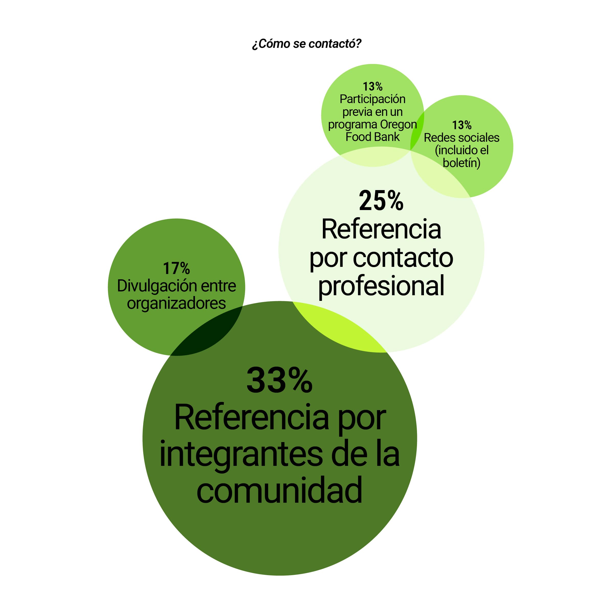
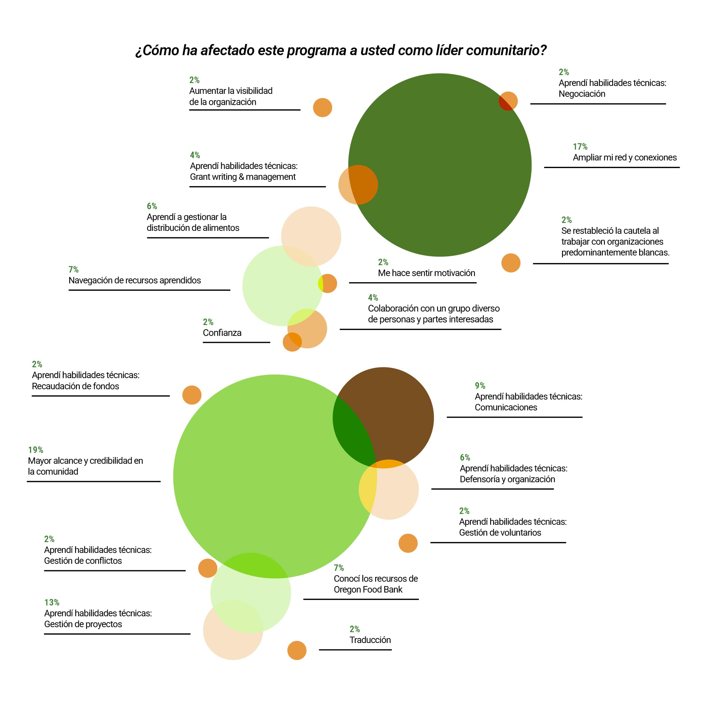
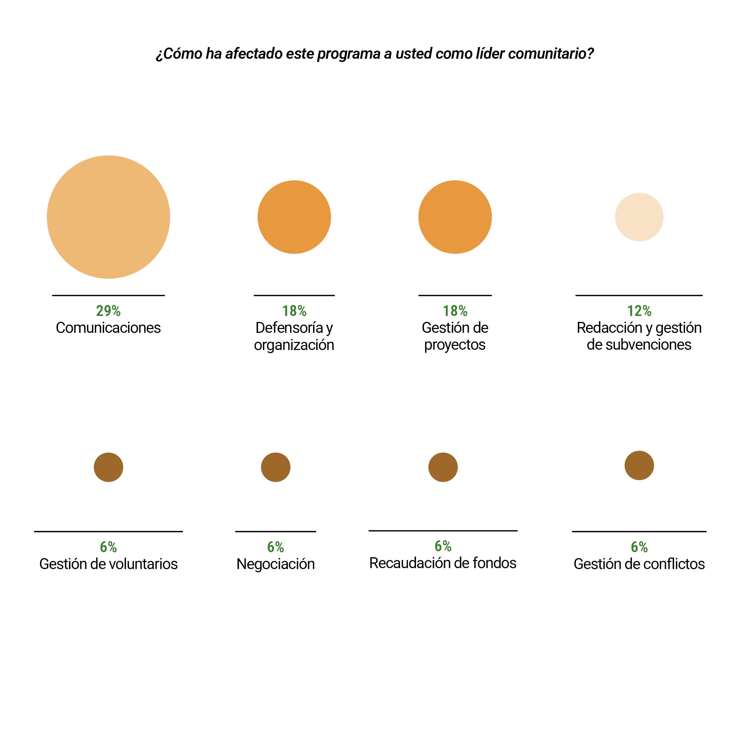
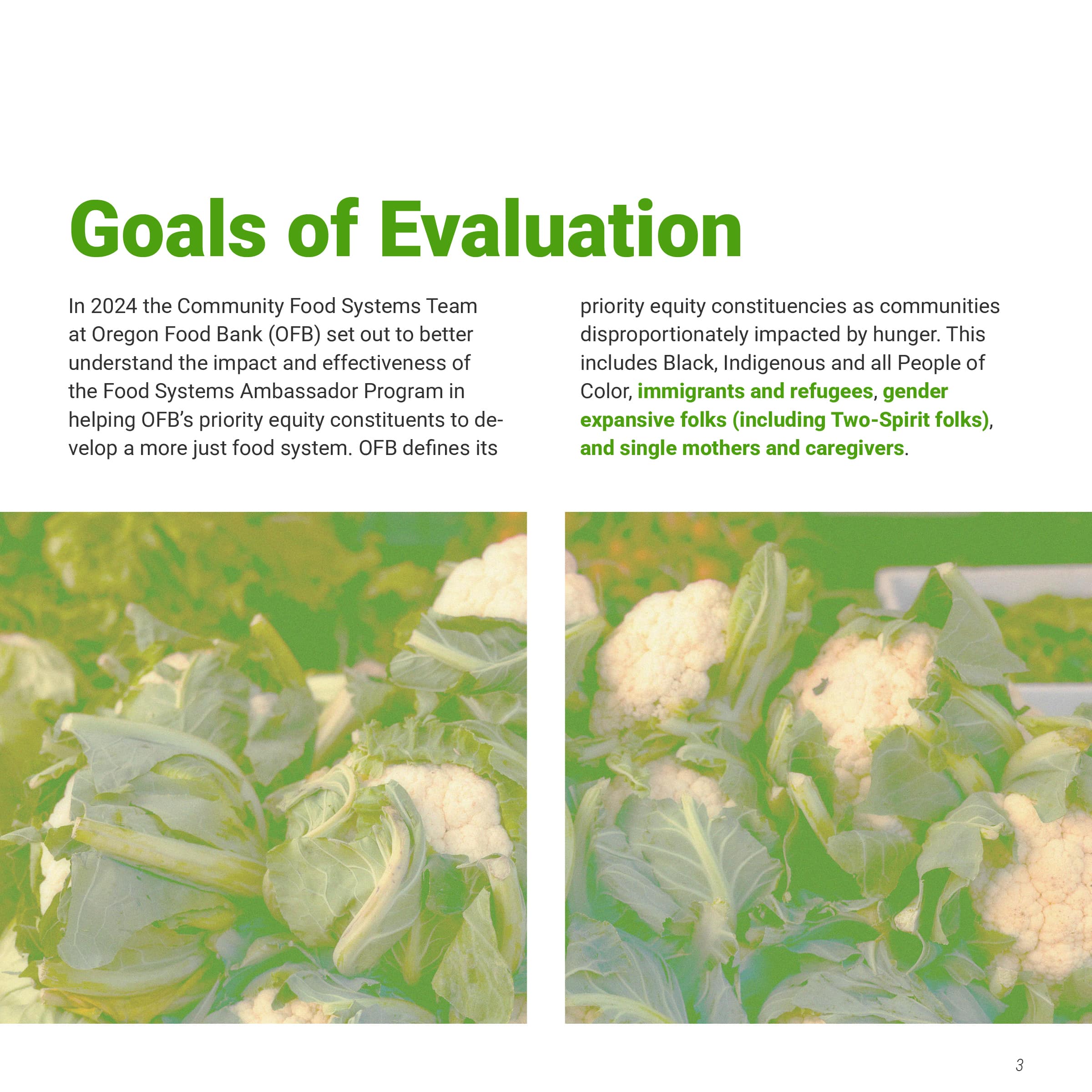
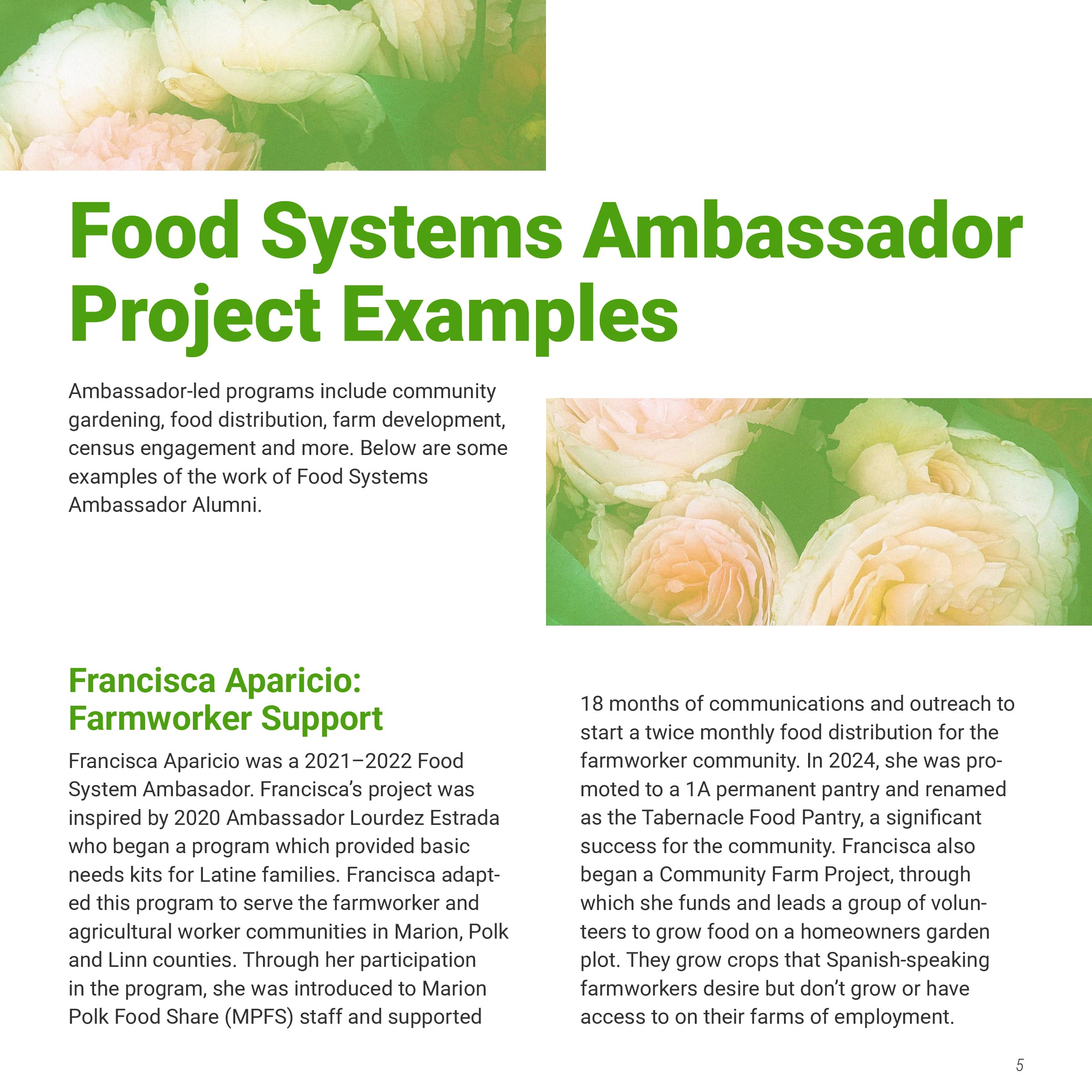
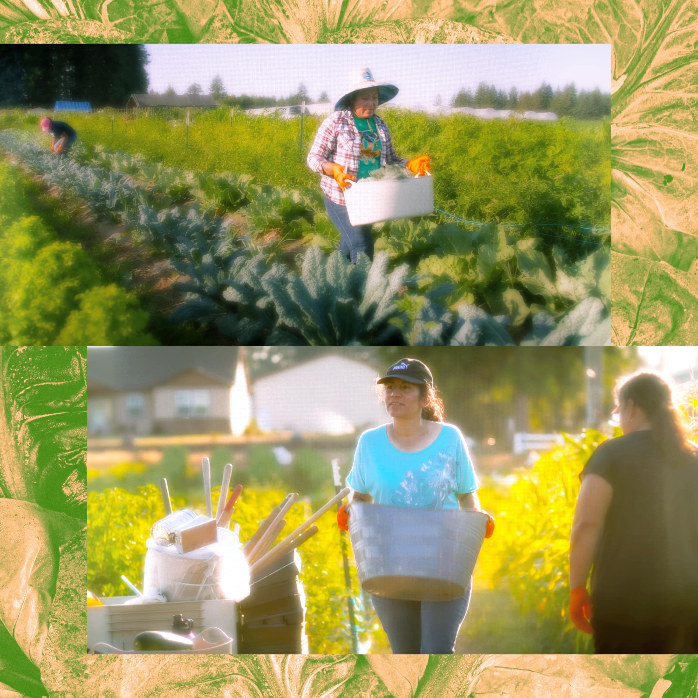
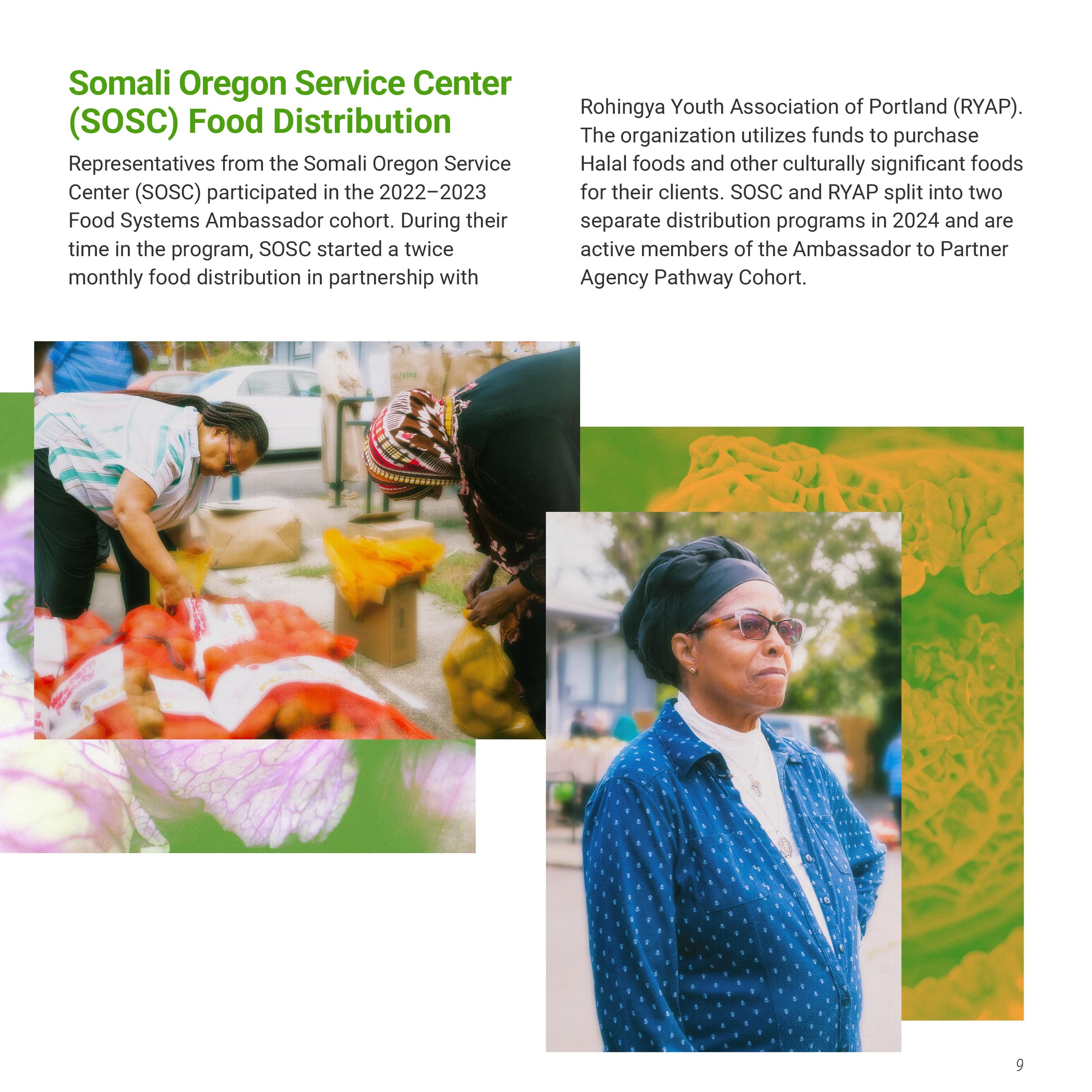
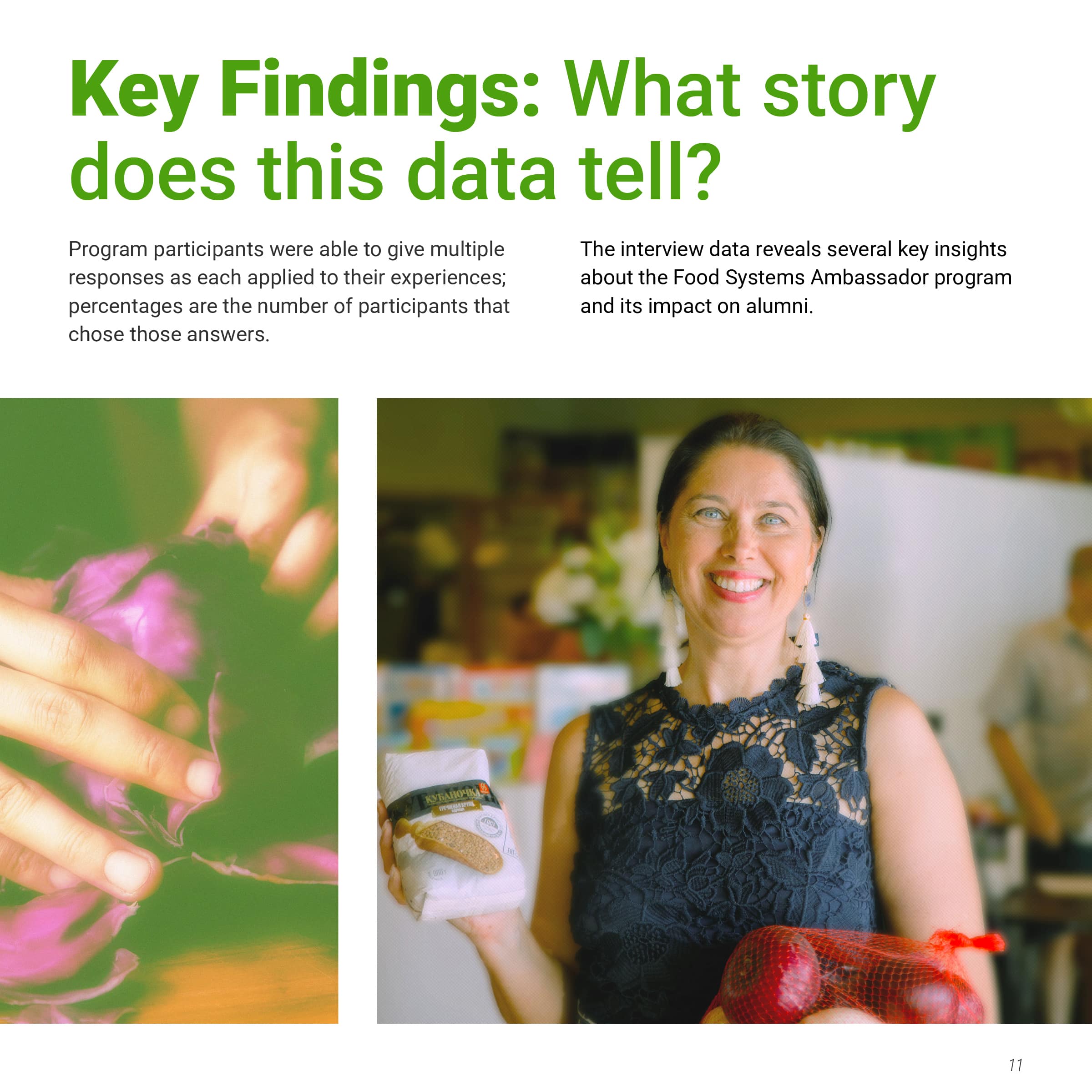
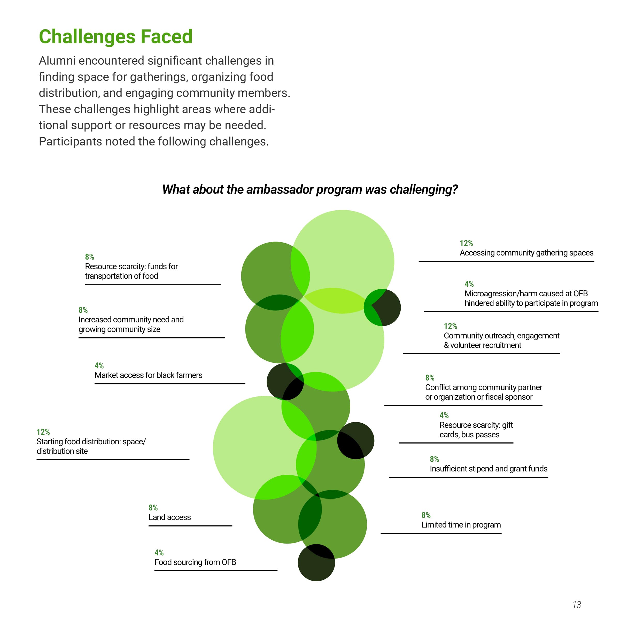
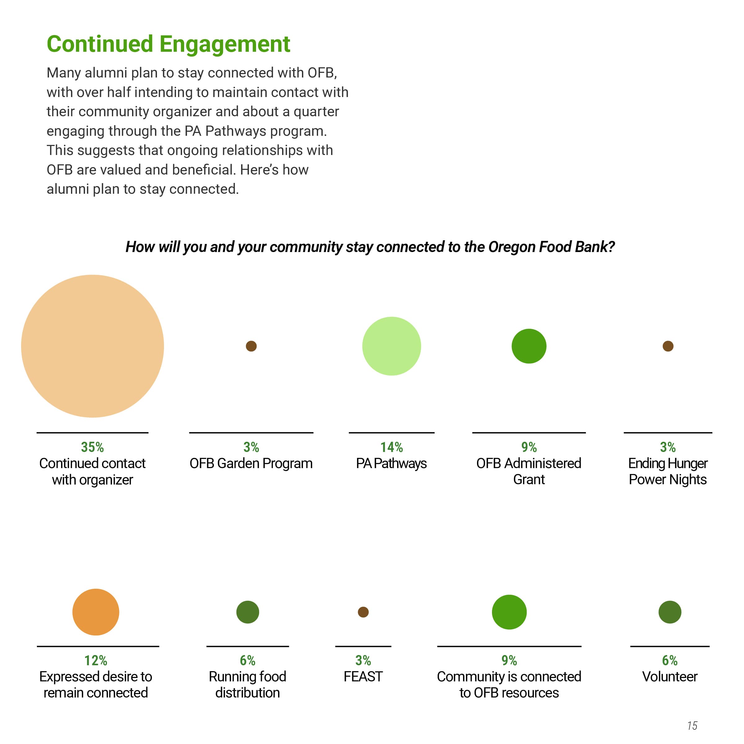
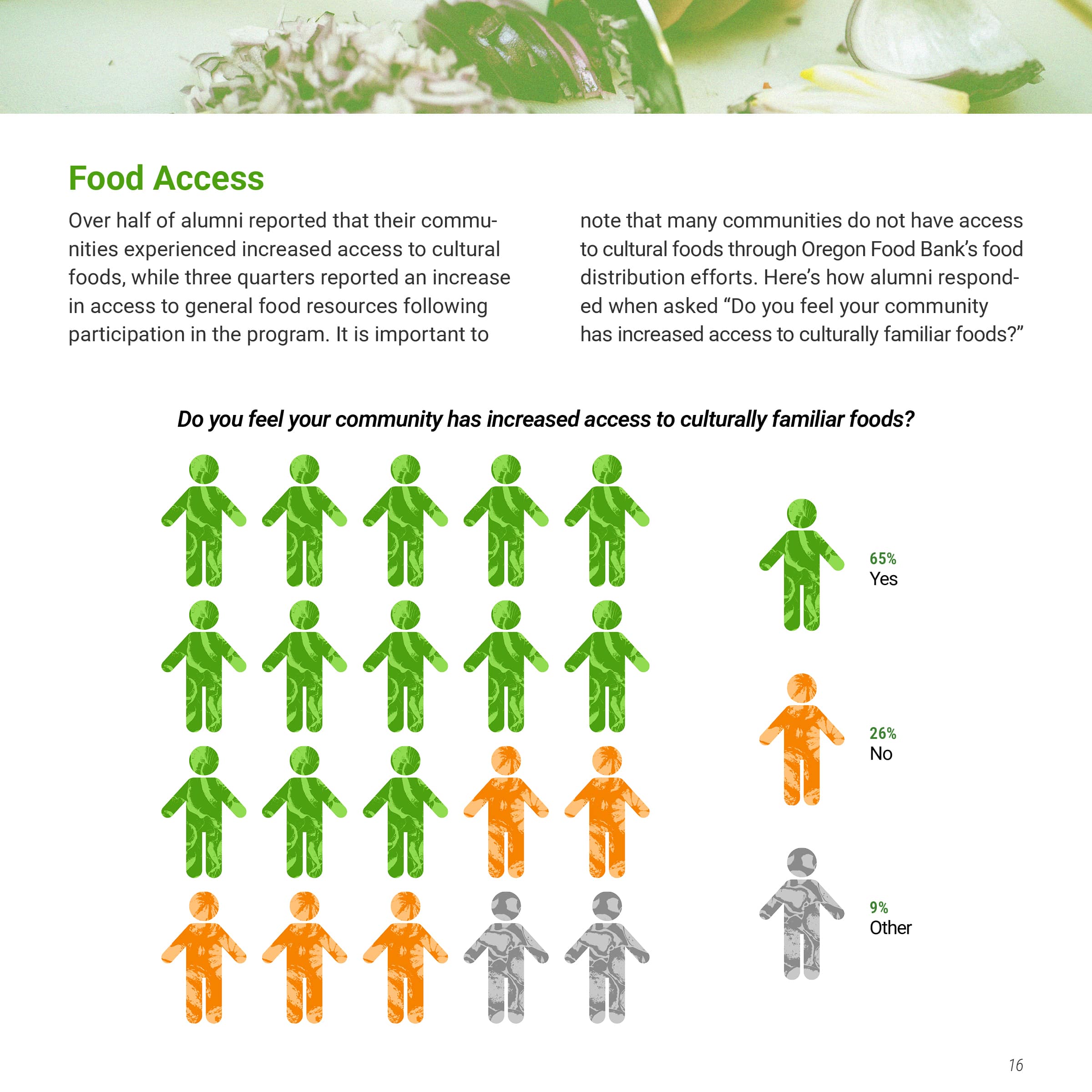
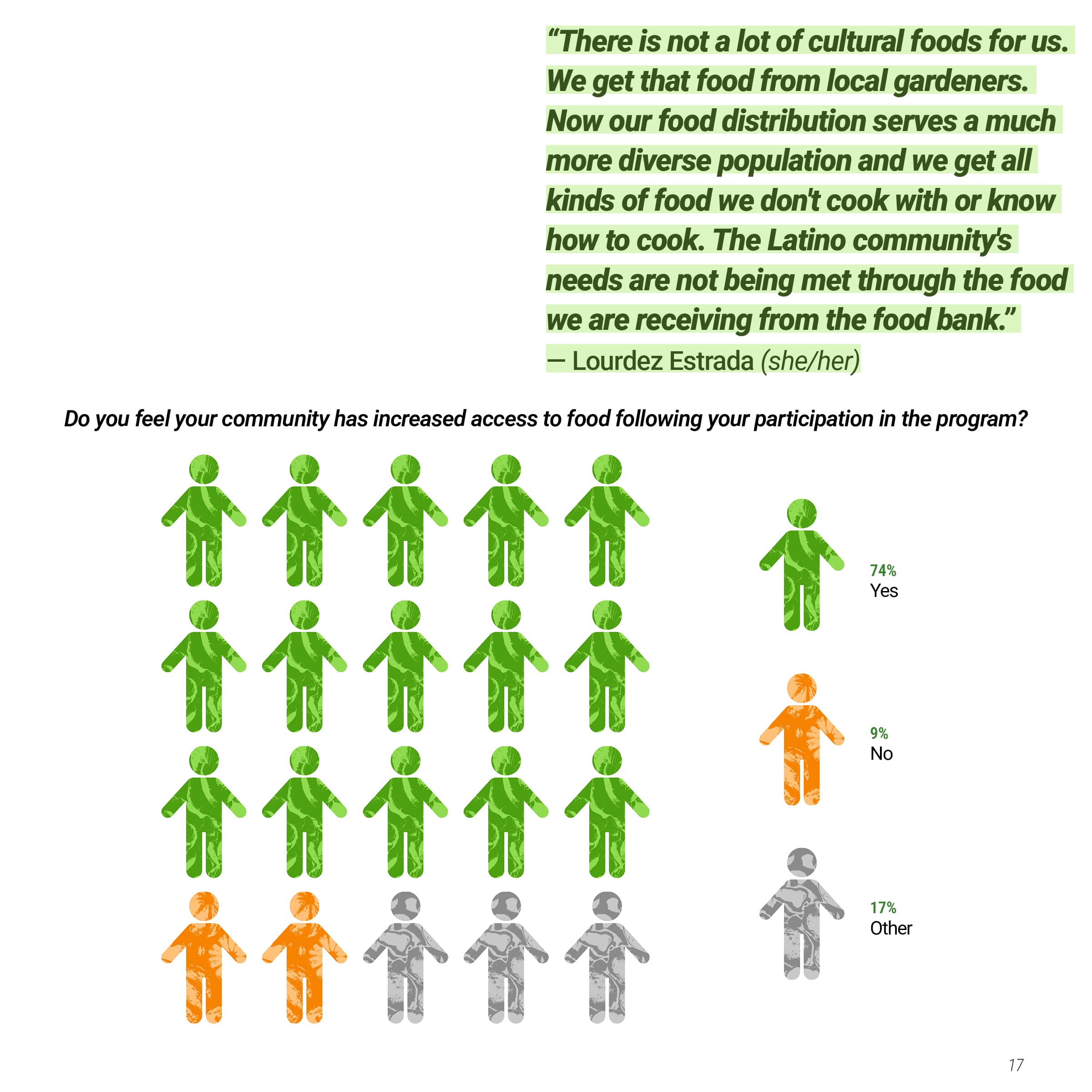
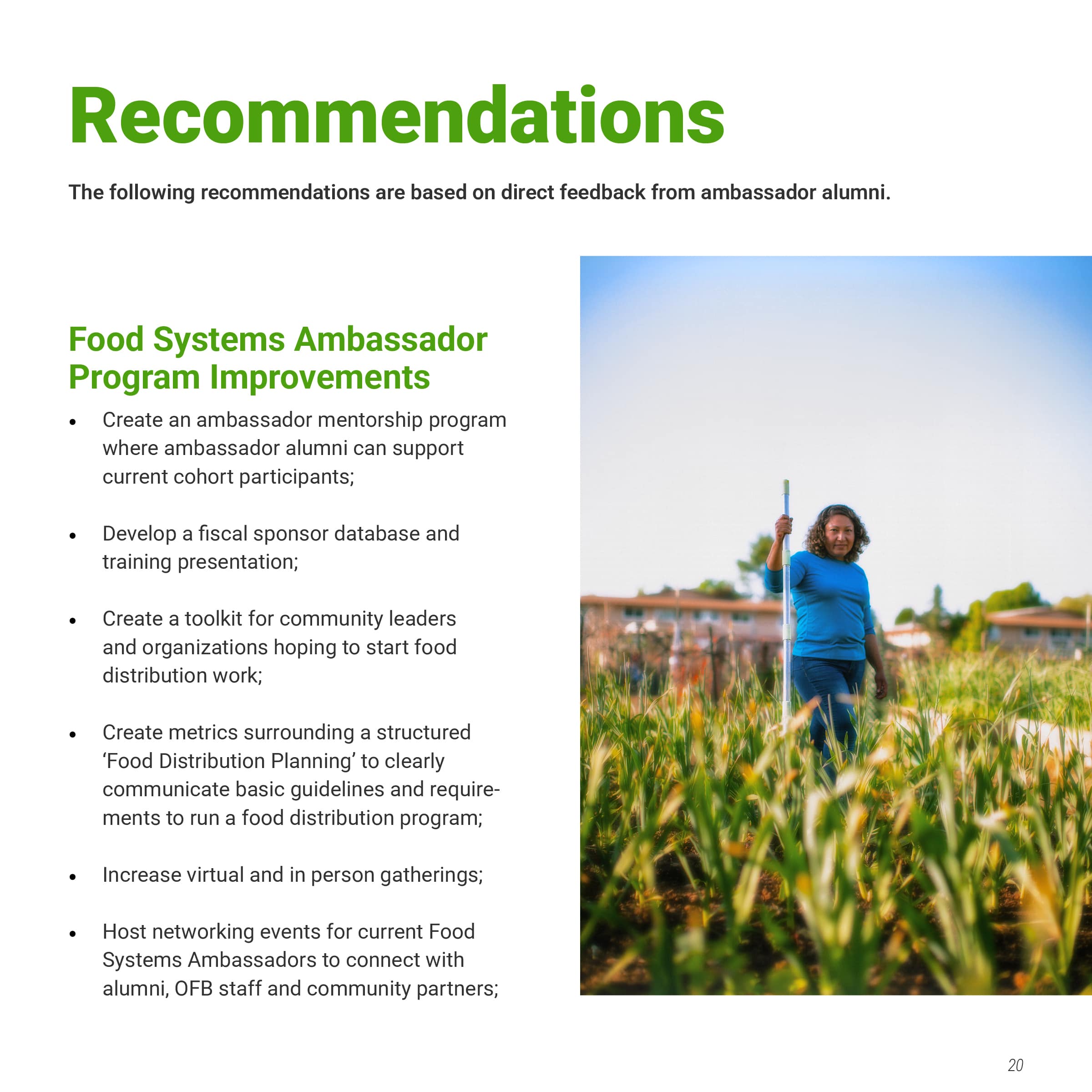
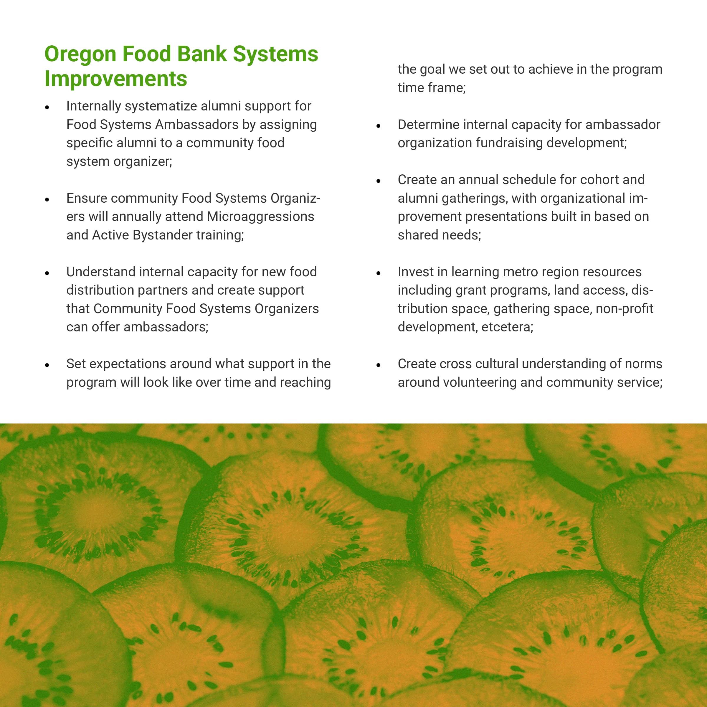
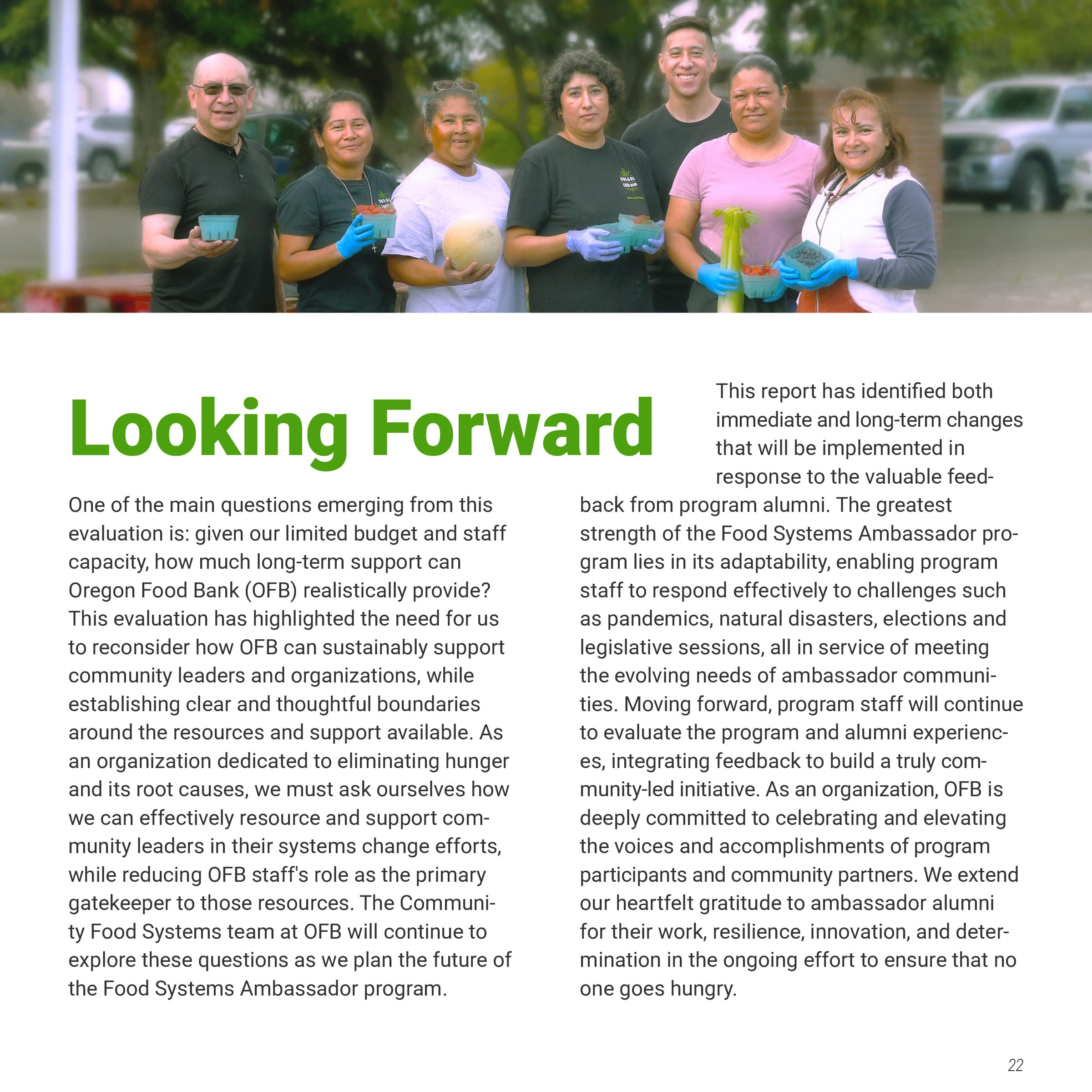
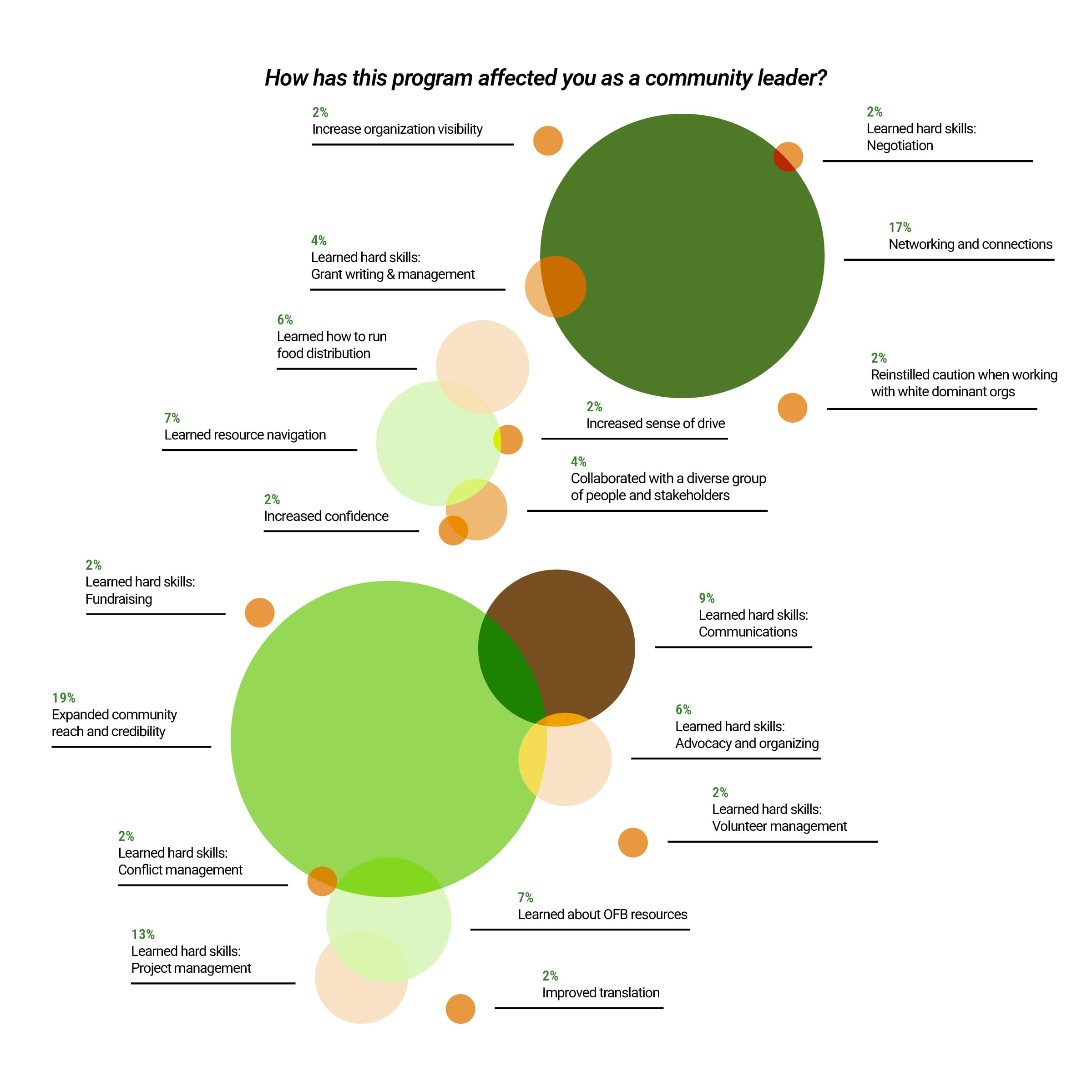
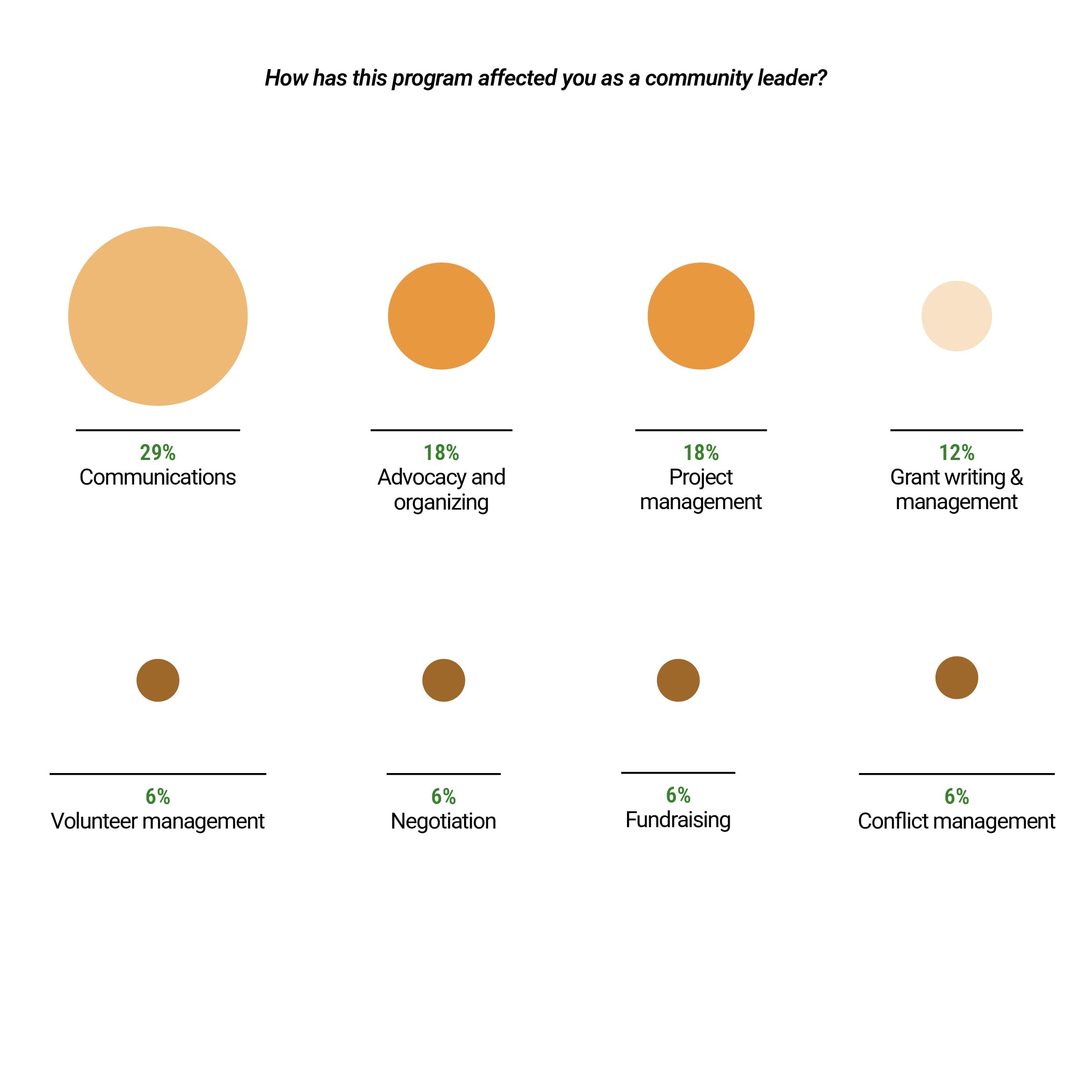
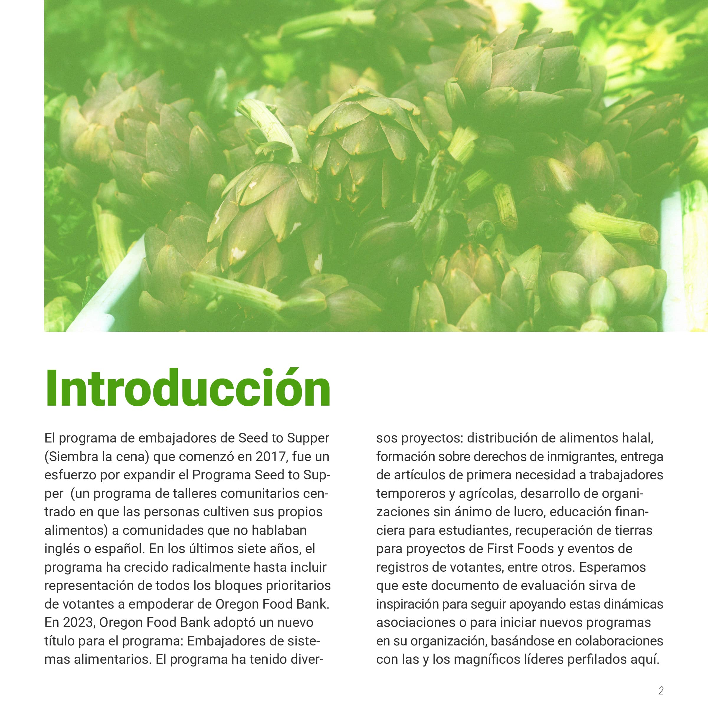
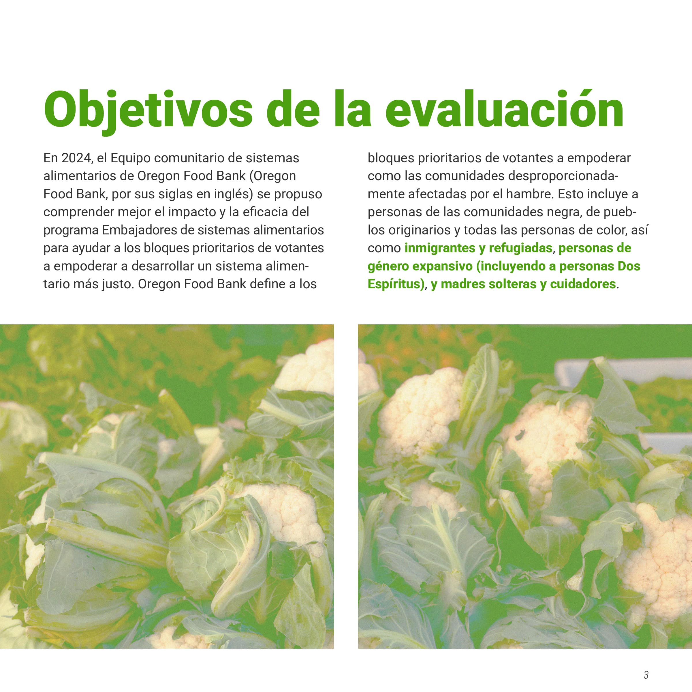
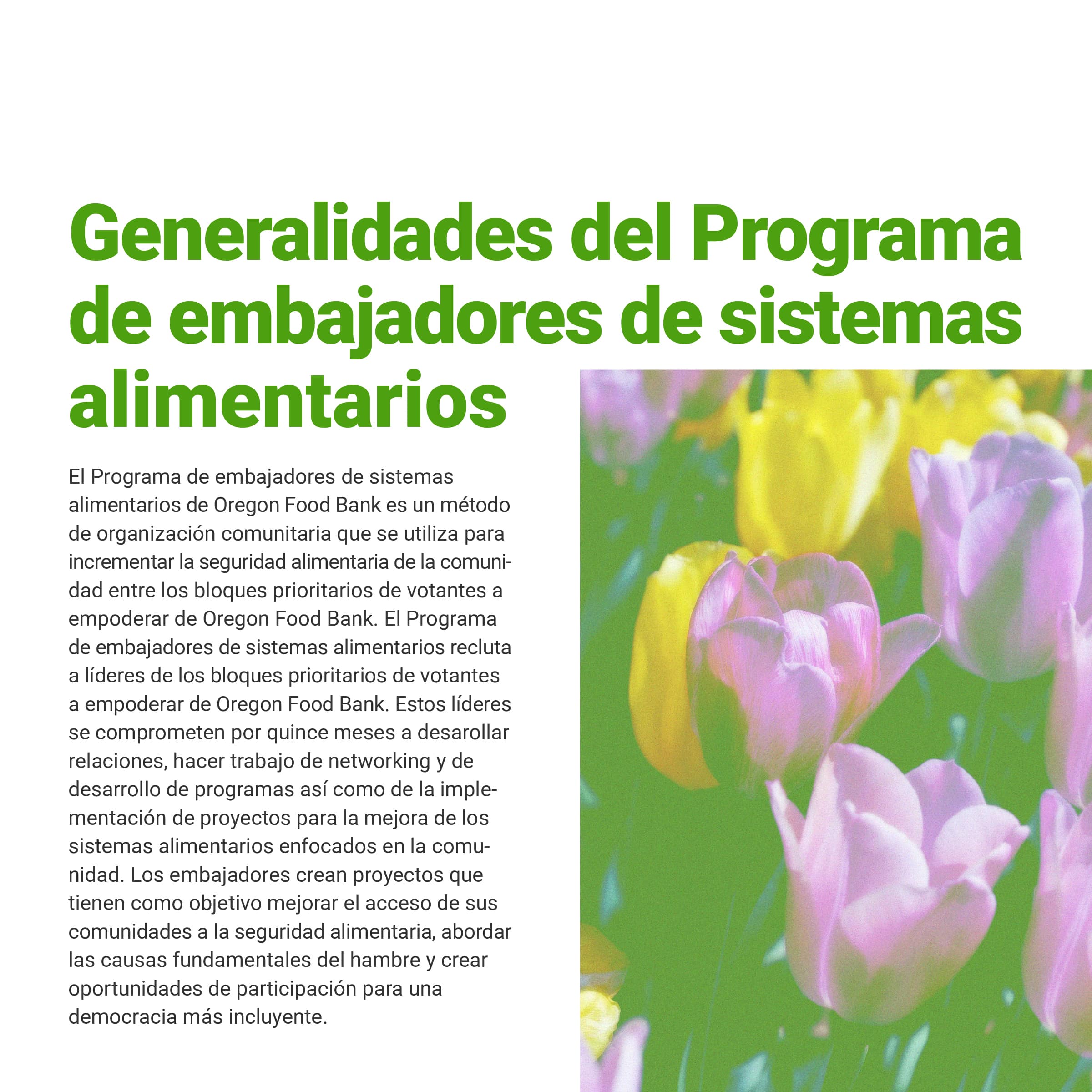
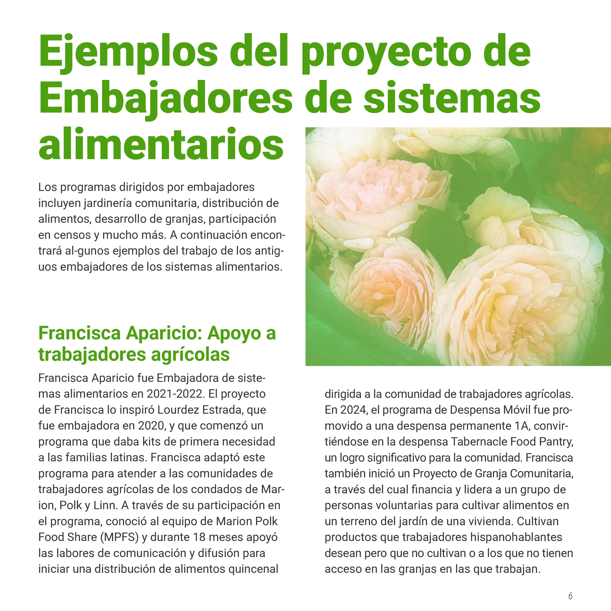
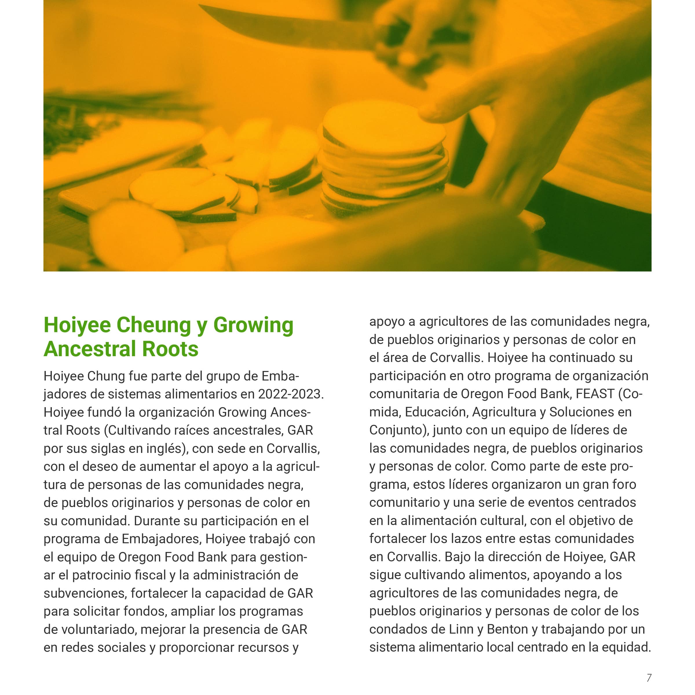
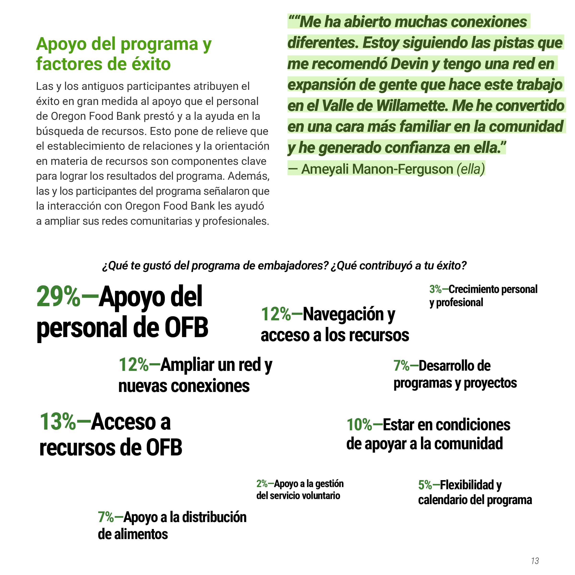
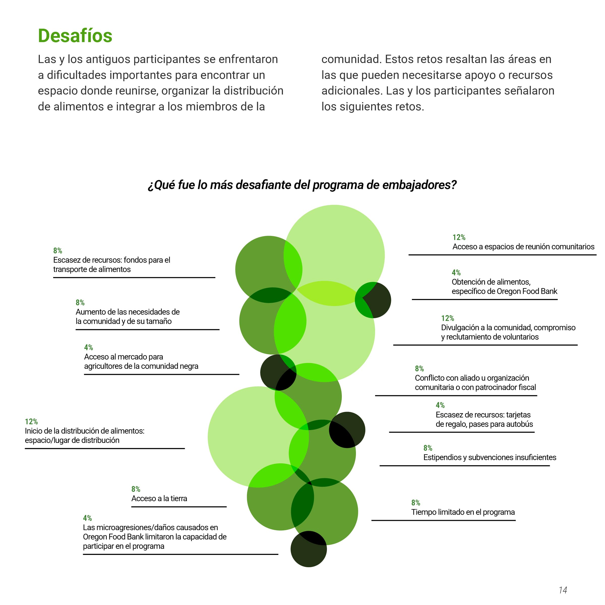
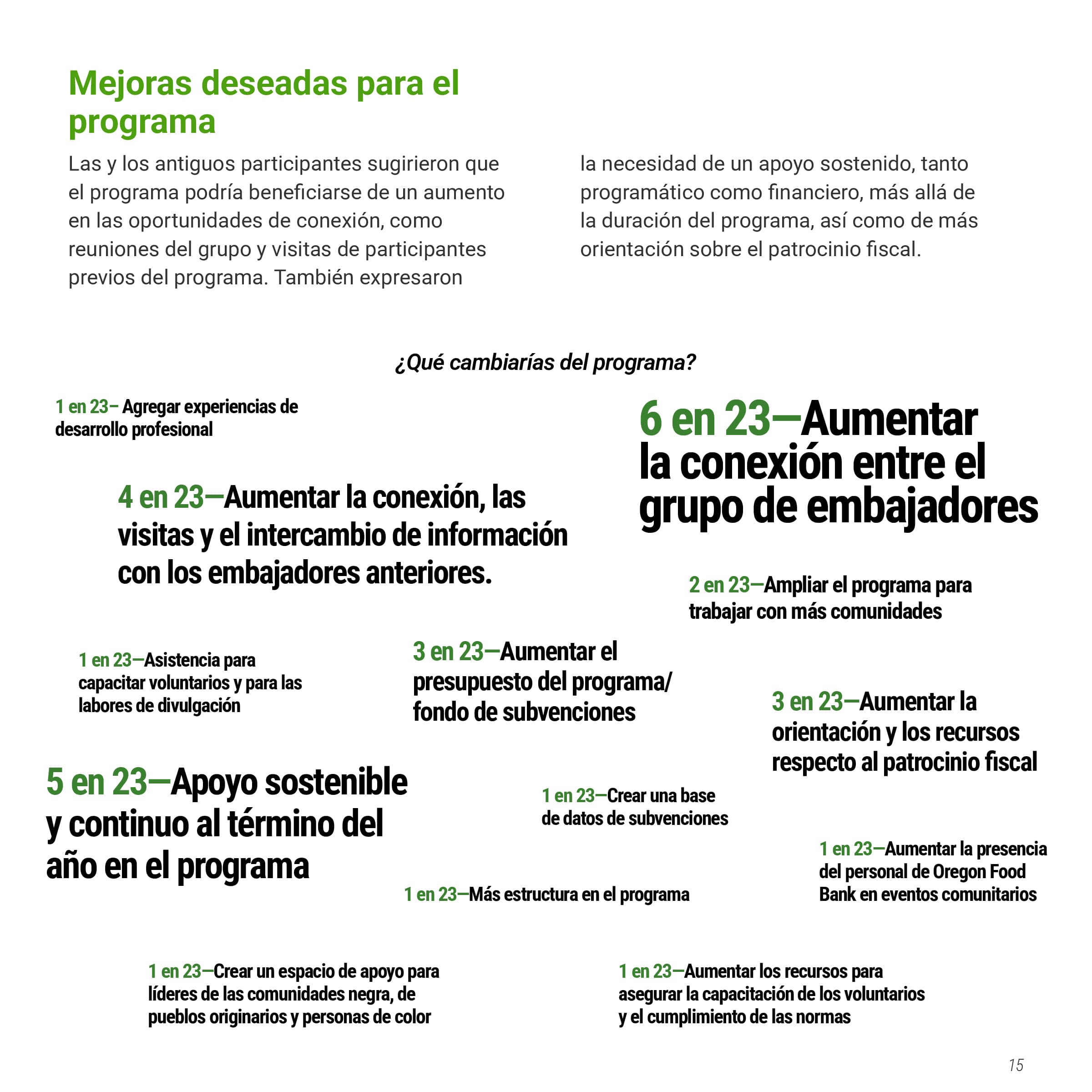
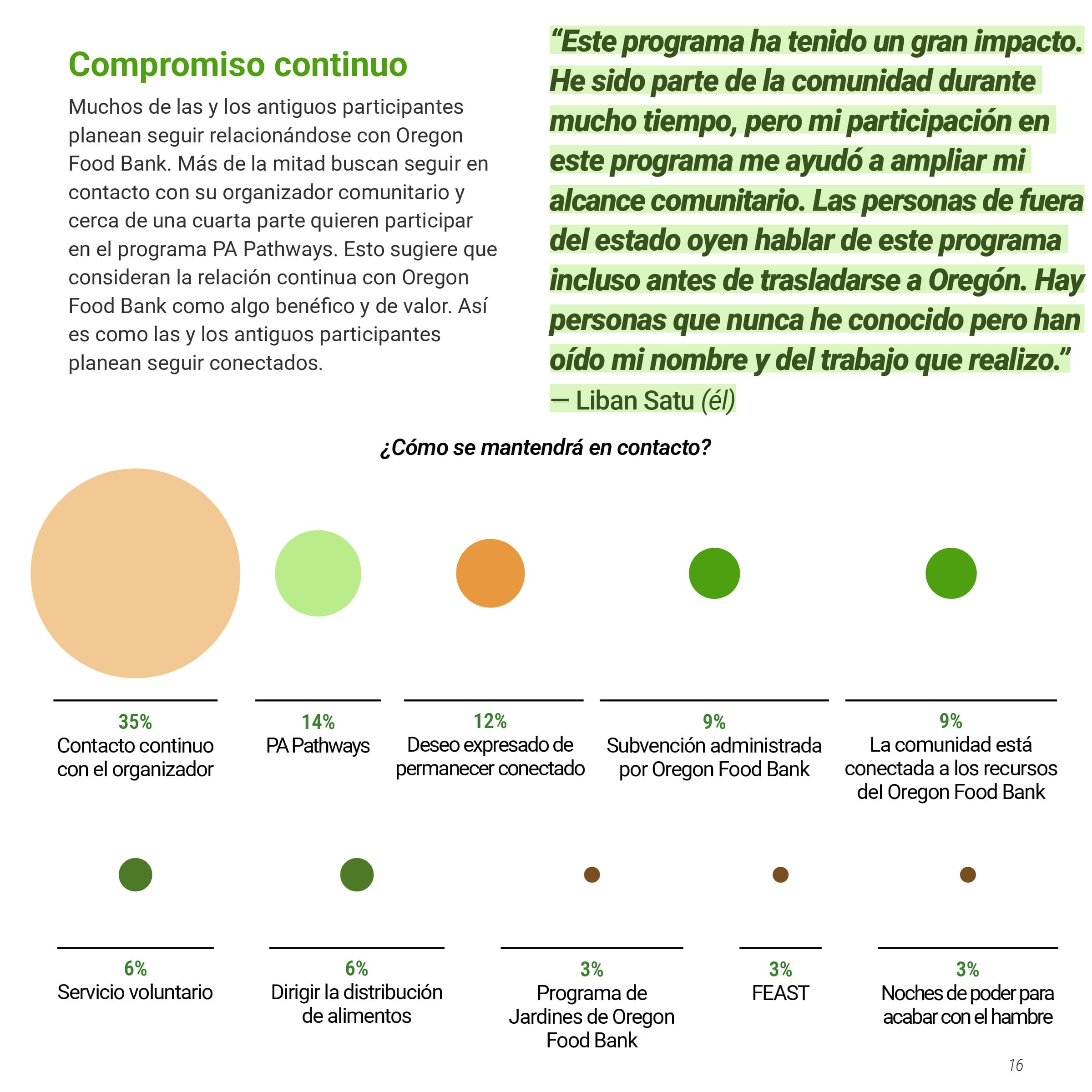
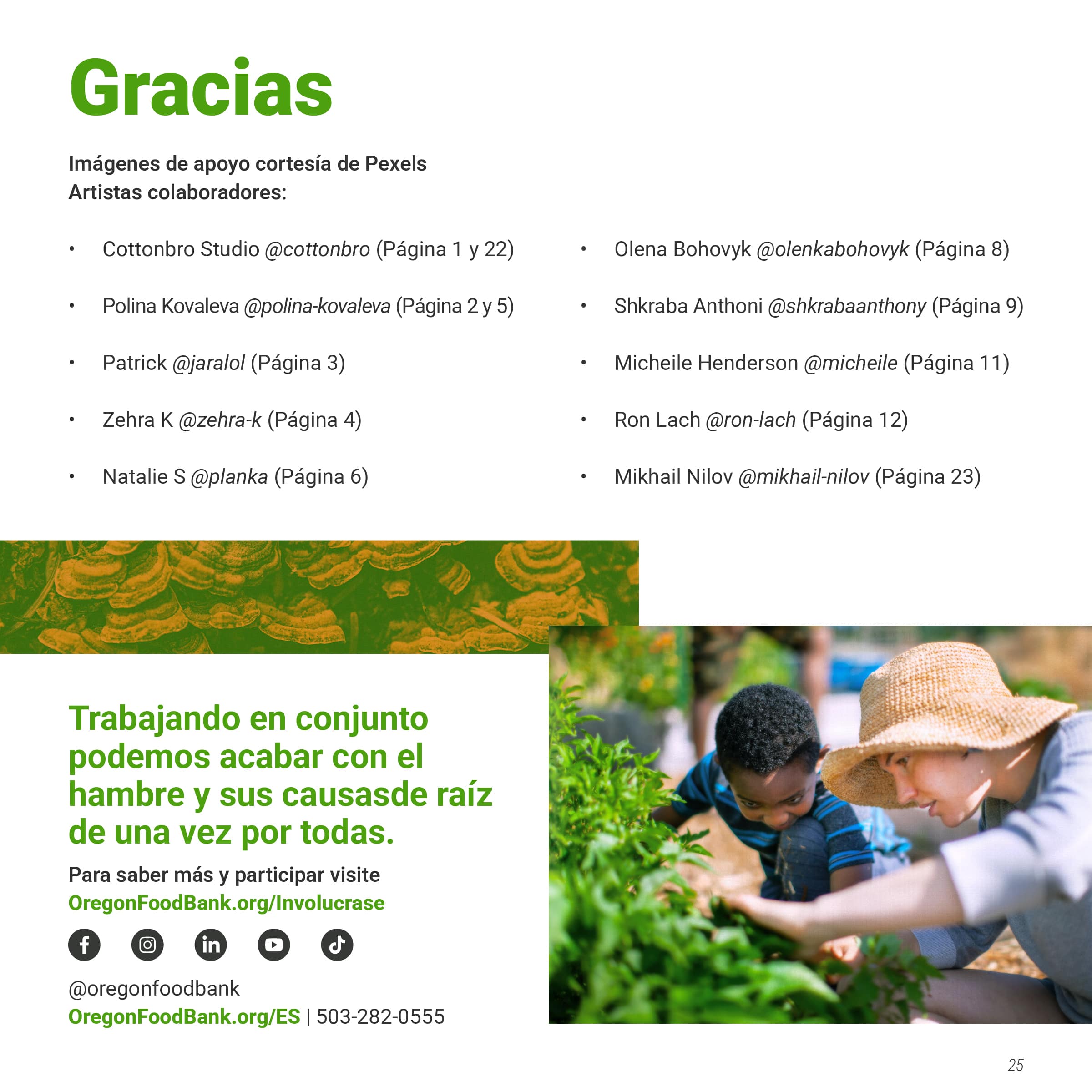
The visual direction is built around the concept of "layers" to reflect the natural layers found in food systems and plant life. This theme inspired the overlapping circular elements in the charts and the photography showcasing layered textures in nature. I picked green and orange from their brand color palette to create a duo-tone effect, adding visual interest to the photography while staying true to their color system. I experimented with shades, texture, tint, blend modes, and opacity to make the chart data visually appealing yet informative while remaining within their branding. A big part of the process was transforming raw data into engaging graphs and analyzing the numbers to determine the most effective chart to communicate the data.
The final document spanned 20+ pages in the English version and 25 pages in Spanish. The OFB team responded enthusiastically to how I pushed their brand’s visual identity while respecting their core guidelines. They responded saying they appreciate working with someone who understood their brand identity and was willing to experiment with its potential. The project demonstrates how thoughtful brand experimentation can refresh an organization's visual approach while maintaining consistency and effectively communicating information.
I worked directly with the Oregon Food Bank's (OFB) multimedia producer, handling everything from initial concept development through final production. My role was to translate their existing brand guidelines into a fresh visual direction while ensuring the document effectively communicated the program's value. As part of my inspiration, I reviewed their previous documents to identify elements that could be adapted for this project. The client encouraged me to push their brand concept as far as possible and gave me freedom to experiment within their guidelines. Throughout the design process, I made sure to explain my thinking behind specific design choices, regularly seeking feedback to ensure the document aligned with their vision.
The visual direction is built around the concept of "layers" to reflect the natural layers found in food systems and plant life. This theme inspired the overlapping circular elements in the charts and the photography showcasing layered textures in nature. I picked green and orange from their brand color palette to create a duo-tone effect, adding visual interest to the photography while staying true to their color system. I experimented with shades, texture, tint, blend modes, and opacity to make the chart data visually appealing yet informative while remaining within their branding. A big part of the process was transforming raw data into engaging graphs and analyzing the numbers to determine the most effective chart to communicate the data.
The final document spanned 20+ pages in the English version and 25 pages in Spanish. The OFB team responded enthusiastically to how I pushed their brand’s visual identity while respecting their core guidelines. They responded saying they appreciate working with someone who understood their brand identity and was willing to experiment with its potential. The project demonstrates how thoughtful brand experimentation can refresh an organization's visual approach while maintaining consistency and effectively communicating information.
English
Roles
Art Direction
Page Layout
Digital Design
Photo Manipulation
Illustration
Informational Design
Art Direction
Page Layout
Digital Design
Photo Manipulation
Illustration
Informational Design


English Charts

Spanish

Spanish Charts
![]()
![]()
![]()