Binh Minh
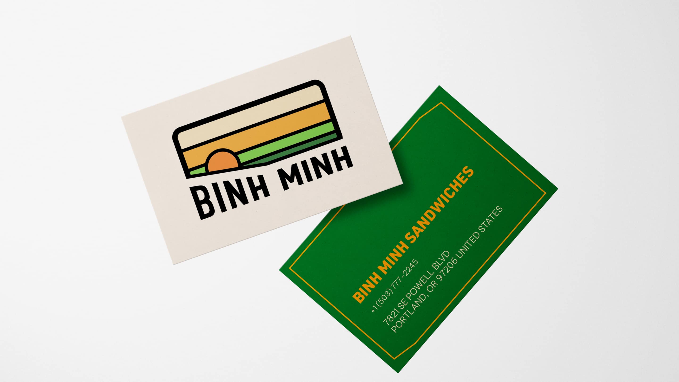
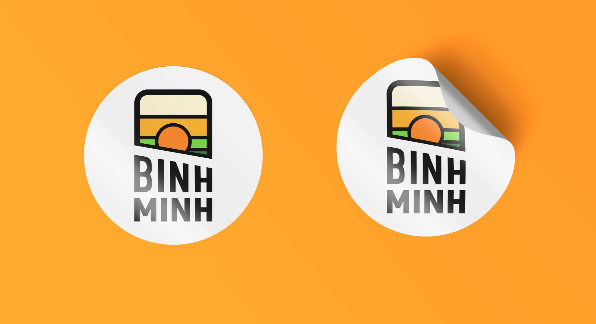
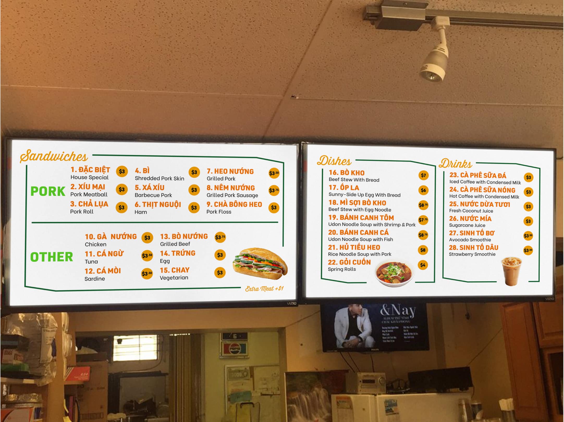
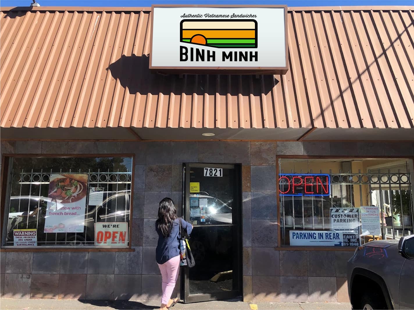
Binh Minh is a small, quaint, counter-serve sandwich shop. Besides banh mis, they also serve entrées, traditional Vietnamese desserts, Vietnamese drinks, Vietnamese snacks, and ingredients to make banh mis. The goal of the rebrand was to help Binh Minh stand out with a strong brand system and spread brand recognition. Binh Minh means “dawn” in Vietnamese, so we illustrated a sunrise in the countryside to convey the brand’s origins. The brand colors reference the colors of carrots and cilantro, which are typical banh mi fillings. There is typically a accent mark over the first “i”, so we made the bottom of the logo slightly slanted to convey that. This is a small business, so we opted for stickers as a cheap option to brand their packaging.
The logo work was done by me. My team member and I collaborated to produce the deliverables.
The logo work was done by me. My team member and I collaborated to produce the deliverables.
Roles
Branding
Illustration
Team
Astrid Luong
Branding
Illustration
Team
Astrid Luong