Keshi - Bandaids
My redesign of Keshi’s “Bandaids” EP visually embodies the EP's central metaphor—treating emotional wounds like physical injuries—by representing the heartbreak and melancholy through a medical analogy.The original album cover didn’t represent these themes clearly, opting for a photo of the artist in front of a sunset. The challenge was to redesign the packaging to visually connect with the lyrics.
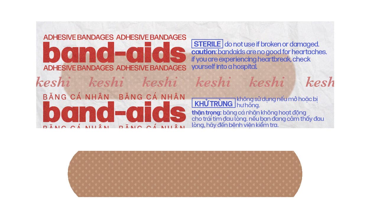
My goal was to build a comprehensive visual story that would enhance the listening experience. I took on multiple roles including art direction, photo manipulation, storytelling, copywriting, and package design. I began by analyzing the lyrics, particularly the title track where Keshi states that bandaids can’t heal heartaches. This statement is a big theme in the album. His melancholy lyrics inspired me to develop a hospital-themed concept featuring an injured care bear as the protagonist. I also incorporated Vietnamese text elements on the bandaid design and vinyl record itself to honor Keshi's Vietnamese heritage.
My redesign uses a medical theme to represent how heartbreak feels, translating the narrative journey of the music into a visual story. It exaggerates the pain to resonate with how heartache seems like the end of the world when the wound is fresh. The design uses a cool, muted color palette to reflect the sterile environment of hospitals and to reflect the dreary mood of the EP. I chose the Grumpy Bear as my protagonist because The Grumpy Bear is notorious for being grouchy, but he helps others understand that it's okay to feel down, which is similar to the cathartic impact of sad music.
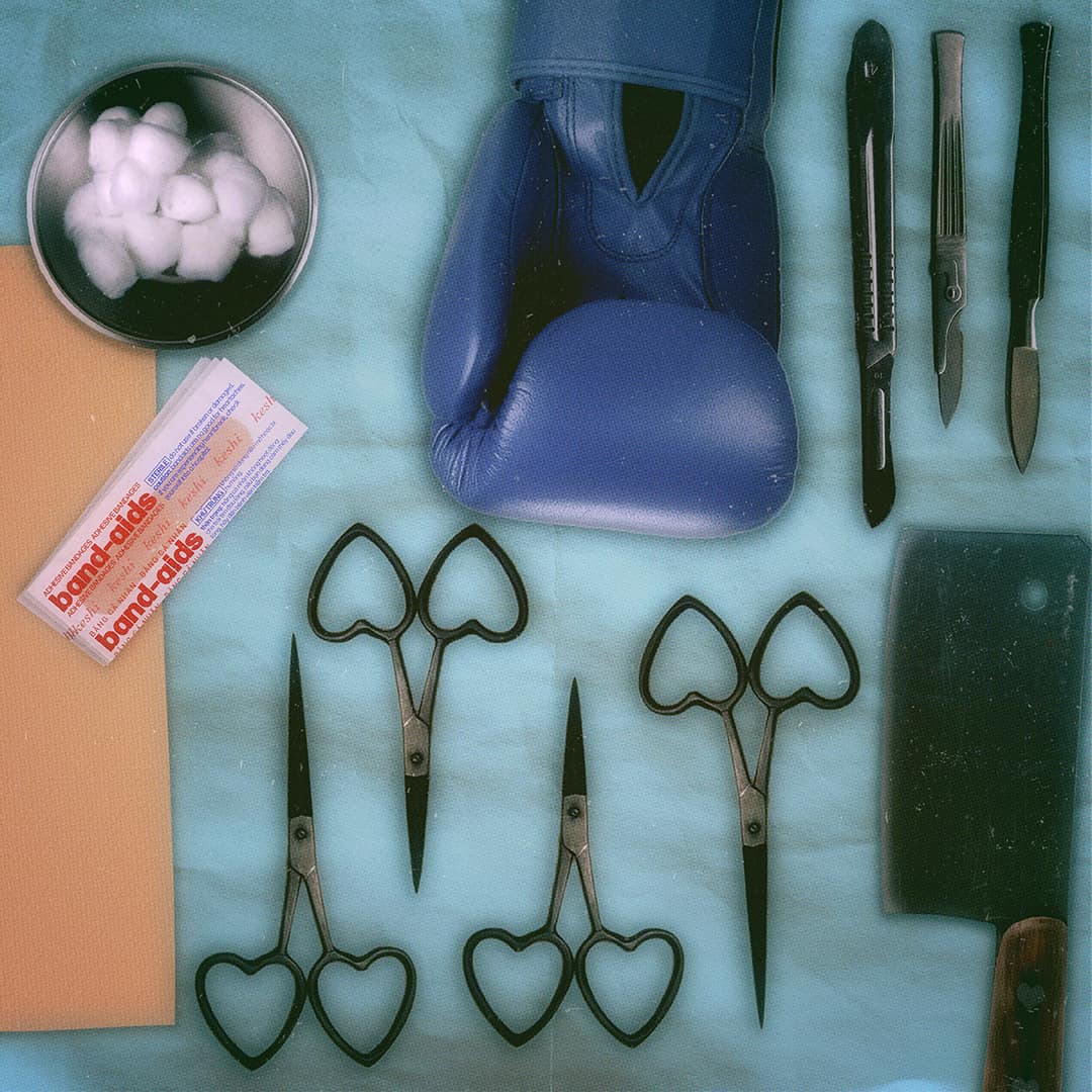
The concept unfolds across four sides of the vinyl, with each side representing different stages of the care bear's emotional and physical journey through heartbreak. The cover depicts the surface damage the protagonist has suffered from emotional wounds. The second side shows the treatment process and the medical tools used by the hospital staff. The third side is a split x-ray of the care bear, revealing that his heartache has also broken him inside, down to his bones. The back cover features the IV bag used to treat the bear, which has the tracklist printed on the label and serves as a warning to listeners about love's potential for harm.
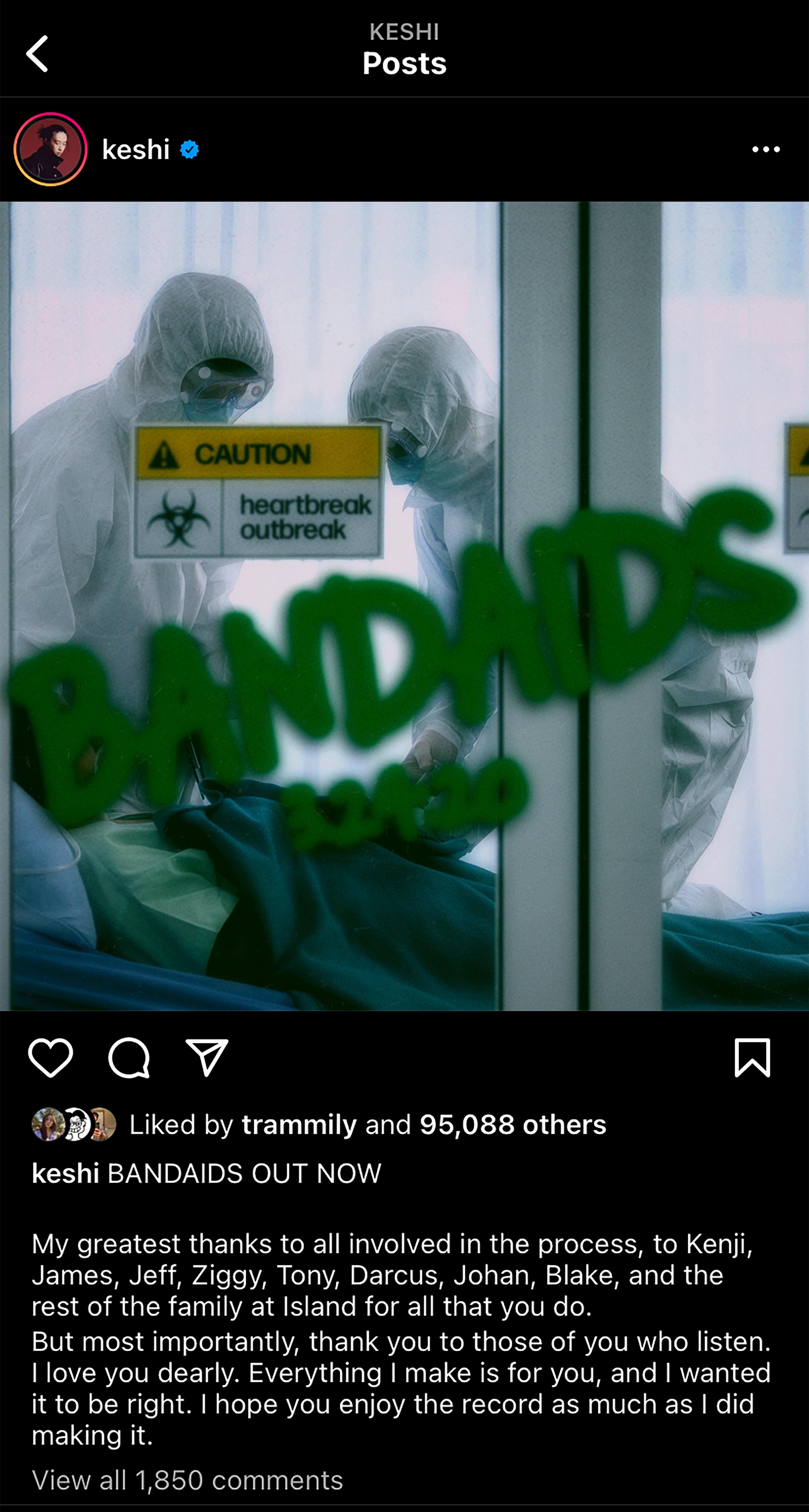
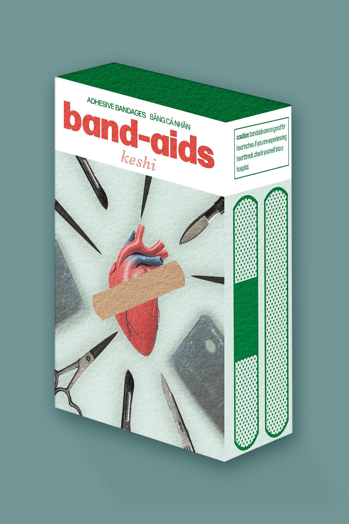
To extend the concept beyond the vinyl itself, I designed a bandaid box as an accompanying freebie, complete with custom packaging that reinforces the medical theme while honoring Keshi’s personal background through Vietnamese text elements. I also created a teaser image for Instagram that maintains the hospital aesthetic while building anticipation for the release.
The redesign successfully utilizes music packaging to represent the lyrics and create a comprehensive visual experience. The medical concept creates a memorable, cohesive narrative that resonates with listeners who connect with themes of vulnerability and healing. The project demonstrates how thoughtful art direction can elevate album packaging from mere decoration to meaningful storytelling, giving fans a tangible way to engage with the music's deeper themes.
My goal was to build a comprehensive visual story that would enhance the listening experience. I took on multiple roles including art direction, photo manipulation, storytelling, copywriting, and package design. I began by analyzing the lyrics, particularly the title track where Keshi states that bandaids can’t heal heartaches. This statement is a big theme in the album. His melancholy lyrics inspired me to develop a hospital-themed concept featuring an injured care bear as the protagonist. I also incorporated Vietnamese text elements on the bandaid design and vinyl record itself to honor Keshi's Vietnamese heritage.
My redesign uses a medical theme to represent how heartbreak feels, translating the narrative journey of the music into a visual story. It exaggerates the pain to resonate with how heartache seems like the end of the world when the wound is fresh. The design uses a cool, muted color palette to reflect the sterile environment of hospitals and to reflect the dreary mood of the EP. I chose the Grumpy Bear as my protagonist because The Grumpy Bear is notorious for being grouchy, but he helps others understand that it's okay to feel down, which is similar to the cathartic impact of sad music.
The concept unfolds across four sides of the vinyl, with each side representing different stages of the care bear's emotional and physical journey through heartbreak. The cover depicts the surface damage the protagonist has suffered from emotional wounds. The second side shows the treatment process and the medical tools used by the hospital staff. The third side is a split x-ray of the care bear, revealing that his heartache has also broken him inside, down to his bones. The back cover features the IV bag used to treat the bear, which has the tracklist printed on the label and serves as a warning to listeners about love's potential for harm.
To extend the concept beyond the vinyl itself, I designed a bandaid box as an accompanying freebie, complete with custom packaging that reinforces the medical theme while honoring Keshi’s personal background through Vietnamese text elements. I also created a teaser image for Instagram that maintains the hospital aesthetic while building anticipation for the release.
The redesign successfully utilizes music packaging to represent the lyrics and create a comprehensive visual experience. The medical concept creates a memorable, cohesive narrative that resonates with listeners who connect with themes of vulnerability and healing. The project demonstrates how thoughtful art direction can elevate album packaging from mere decoration to meaningful storytelling, giving fans a tangible way to engage with the music's deeper themes.
Roles
Art Direction
Photo Manipulation
Copywriting
Packaging Design
Storytelling
Art Direction
Photo Manipulation
Copywriting
Packaging Design
Storytelling